Problem
On the Ontario.ca website, there is no notice provided to users about the use of cookies.
The Marketing and Digital Strategy team wanted to introduce marketing cookies. In order to comply with Canada’s Anti-Spam Legislation there must be a tested cookie consent banner on the Ontario.ca website.
This banner must meet business needs and provides Ontarians with relevant information.
Outcome
We created and tested a cookie consent banner with behaviours, content, and functionalities that were understandable and easy for Ontarians to use. We also revamped the policy pages in collaboration with our Content Writer.
It was necessary that we walked the fine line between informing Ontarians about their cookie options, and while not distracting them from their task at hand.
Preliminary research
What is a cookie?! 🍪
In order to have an evidence-based first iteration, we conducted a wide range analysis of other banners in various jurisdictions and private sector companies to determine banner best practices. Since my team and I were going to be creating a product explaining their functionalities- it was imperative that I educated myself on what cookies did.
Learning about cookies
I began by understanding what cookies are, accessible cookie consent prompts, and guidelines for banner design. Then I dove into understanding Ontario-specific cookies, and determining considerations from policy and development.
Exploring the landscape
My team and I then explored various other design systems and examples of cookie consent banners. Our inspiration ranged from other Government organizations, to examples of retailer sites (baby gifts, hotels, and more!) we found while navigating through the web.
UK Government standard
We found that the GOV.UK website had also begun their discovery process into creating a cookie consent banner, and were continuously publishing their findings. We looked into their discoveries to see if we could find anything important, and used their banner as the basis of our design.
User flows mapping
Finally, we mapped out the various user flows that participants could encounter, depending on their entry point into the Ontario website, and their subsequent actions.
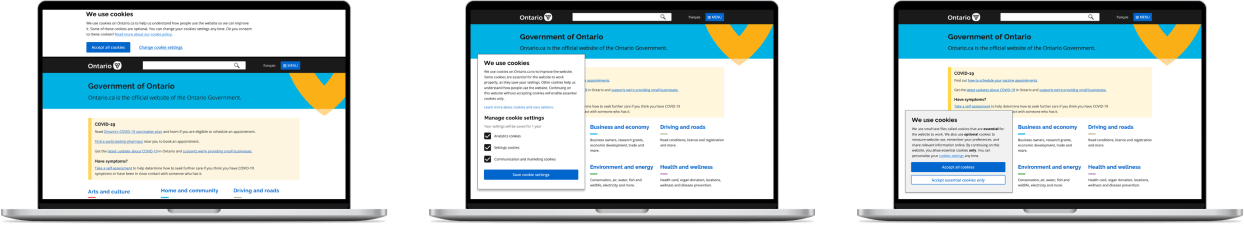
Version One
Based on our research, and the required business needs, the first iteration of the cookies consent banner was created to bring to testing.

Zoomin’ through usability testing
For our first round of testing we had 11 semi-structured one on one interviews that were 45 minutes each. Since we were designing for both mobile and computer users, we had 7 users test the product on their computer and 4 on their mobile phones using Zoom.
During the testing, we had diversity in demographics, accessibility needs, and concern with internet privacy (as determined from our initial screener).
We asked participants to complete two information-seeking tasks where they encountered cookie consent banners, to understand their organic reaction for both use cases. After the tasks, participants were invited to discuss their experience with the task and the banner, as well as review the 'Cookie settings' page and 'Privacy statement'. Some limitations to consider were that participants may not be in an "authentic" mindset and their feelings may be different from a user encountering a concept on their own and without observation
What we found and what we changed
Overall, we found that users felt forced to accept all cookies. They felt skeptical and unsure of the information they were seeing.

During the usability tests, we took notes of participant quotes and key findings. In order to synthesize our results, we conducted an affinity mapping exercise for each of the pages we tested.
Key finding
Participants felt a lack of autonomy due to only having one call-to-action button on the banner.

“Slightly irritating and dishonest. I would want accept all cookies and something equally prominent that is not require all cookies.
Changes
Secondary button added to the banner to allow users to accept only essential cookies
Tertiary expandable option added to the banner to let users make personalized choices
Hyperlinked option removed since it was too reminiscent of an informational link

The first version of the banner and the changes made from the usability tests
Key finding
Most participants felt the banner was too large, and wanted more information on the cookies’ impact in their life.
"It’s really not very informational. It barely says anything really. This is really big."
Changes
The banner was moved to the bottom left of the page to reduce the amount of space taken if more information is added, especially on mobile. In the case that more important banners such as a COVID banner is put on the page, moving the cookies banner ensures that new banners are noticeable.

Changing the placement of the banner
Version Two
Based on our findings from our usability testing, and changes to copy, the second iteration of the cookies consent banner was created.

Talking to stakeholders
We shared our findings and corresponding changes to our colleagues at the Marketing, Business, and Data departments of Cabinet Office, who were very receptive to hearing the results of our user testing. However, they mentioned that the main business need of the project was to get uptake on the communication and marketing cookies, and were concerned that providing a tertiary option would take away from achieving the business need. Since we had already provided a secondary button to increase user autonomy which had not been tested yet, we removed the tertiary expansion option to determine if users were comfortable with just having two calls to action.
We also changed the background colour of the popup from white to grey in order to have it stand out more as the business team wanted to make sure that some action was taken on the popup to determine how users felt about the options provided.

Final Version
After talking with stakeholders and making changes to reflect business needs, the third iteration of the cookies consent banner was created.

Zoomin’ through usability testing (round 2!)
For our second round of testing, we asked participants to complete one information-seeking task where they encountered cookie consent banners, to understand their organic reaction with the redesign. After the tasks, participants were asked to discuss their experience with the task and the banner, as well as read through the new 'Cookie settings' and 'Privacy statement' pages.
A limitation in the testing was that we were asking users to read through policy statements which most users indicated that they would never organically do.
What we found and what we changed
Users appreciated having the choice to accept or decline, and felt that the language used in policy pages was very digestible
Based on our usability tests we came to the following conclusions:
Keep the definition of cookies in the banner, as all participants found it helpful.
Conduct live A/B testing to explore variations of other ways to provide accept and reject options.
Add examples of analytics, settings and preferences, and advertising cookies to be more topical
Provide information about how blocking all cookies through their browser would impact their experience.
What did I learn?
1. Conducting user interviews
Working at the ODS, I was able to conduct usability tests with observers and get feedback on how I could improve. I learnt the importance of letting the user fill the silence, and building questions on the spot based on participants' actions and reactions.
3. Delayed deadlines are part of the game
What started off as our 'starter project' meant for 2 weeks ended up taking 4 whole months, with our final presentation the day before my internship ended! I learnt how to work in Agile sprints and focus on the getting the short term tasks done, knowing that it would all fit together at the end.
3. Involving a holistic team
As one of the primary team members in an ever-expanding team, I had the chance to work with all the various departments involved. I learnt the importance of cross-functional collaboration with content designers, developers, and business stakeholders in order to ensure that all the various points of view are considered.
SPECIAL THANK YOU
A huge thank you to the ODS Lab - Shannah, Mira, Sukhi, Sharon, Joel, Flora, Garima, Jamie, Fatima, Mehak, and Gianina - for helping me through my first internship, allowing me to bring products to the people of Ontario, and letting me work doing so many things I enjoy!

Summer meetup after COVID lockdown!