A Kitchener-Waterloo based community fridge consisting of fresh, donated foods that anyone can take from for free. Designed to facilitate access to food and reduce food waste, Community Fridge KW is the first of its kind in this Region.
Overview
Problem
The KWCF admin team consists of less than 10 individuals who manage a variety of operations activities, which primarily include scheduling donor drop offs and coordinating volunteer shifts.
Currently, all donor drop-offs are managed by one admin who keeps track of everything in their email. This causes issues when the admin is absent, or when others need access to information.
Outcome
Our team built a donation and volunteer scheduling platform for the KWCF, so that they have a centralized database of the following information:
Which donors will be arriving, what they are bringing, and their donation times
Immediate understanding of times the Fridge is low on stock
When volunteers are required, and when volunteered have signed up for shifts
The duration of the project was scheduled to be 8 months, and I was assigned to this team for the first 4 months of the project. Due to this, most of my work focused on laying the groundwork for the project by scoping it, and creating the design system. I also created the first feature to be deployed on the product - the donor scheduling flow for food drop offs.
Project scoping
This section covers our discovery from conversations with the KWCF team, and volunteers. We were able to identify the key pain points and opportunities for each of our user groups, and create a user flow outlining how our solution would solve their problems.
Since we were starting this project from scratch, we had to understand what the problem area was, who it was affecting, and how much of it we would be tackling. The goals of scoping were the following:
Building a shared understanding of the problem.
Drawing on any different viewpoints.
Identifying & prioritizing challenges (with a focus on MVP).
Expanding on the current vision.
How do we figure out what to do?!
In our initial conversations with the KWCF team, we determined that there would be three main user groups we would be targeting to create a solution for: donors, volunteers, and the admin team.
Admin
We sat down with the KWCF team to gauge an understanding of their key problem areas in their everyday processes. After several conversations, this was narrowed down to the following:
Non-centralized space for information management.
Inability to identify gaps in donation schedule.
No way to contact all the volunteers at once to notify them of changes quickly.
Volunteers
We did the same with 5 different KWCF volunteers and found that their specific pain points were not knowing what was expected of them at their volunteer shift, and oftentimes having to wait around for extended period of time while doing nothing until the donor arrived.
Donors
While we were not able to directly speak with any donors at this part of the research due to a lack of comfort from the KWCF team, we gathered some insight from conversations with the Admin team instead and our personal research with family and friends who have donated in the past. Based on this, the assumed pain points for the donors were
Lack of ease for rescheduling and recurring donations.
Multi-platform communication.
Lead time in confirmation.
We recognized that these challenges were assumptions that we had made based on secondary research, which needed to be validated upon testing of a MVP version of the product.
Core pain points, areas of opportunity, and problem statement for each user group
Understanding our users
To align our priorities for the MVP solution, we mapped out each user’s current journey and identified where in this process a technology-based solution can be added. With this being an online and offline process, it was important for us to identify where problems could be solved with our software, versus where problems could be solved with solutions in the physical pipeline.
Based on this, we were able to create ‘How Might We’ statements to address the specific problem points. Instead of focusing on one issue right off the bat, we chose to dive into the problem space. This allowed us to create the following problem statements for each user group, encompassing their key concerns.
DONOR PROBLEM STATEMENT
How can I schedule and update donation times without waiting for confirmation from the admin team?
VOLUNTEER PROBLEM STATEMENT
How can I communicate with both the donors and the admin team so I know when to arrive to the KWCF?
ADMIN PROBLEM STATEMENT
How can I get an overview of all donors and volunteers to identify any gaps?
What do we want to do?
In order to come to a path to take on how were going to approach the solution, we conducted a “Crazy 8’s” activity where we drew out the eight features we felt would be most useful, or most impactful. After doing this, we found that while the functionality of some of our features differed, they were foundationally rooted in the same concepts of: providing transparency, bridging the gap between physical problems and digital solutions, and allowing for quick communication between all parties involved.
We then created a new flow for our system for each user group and outlined how the various features we had would interact together.
User flow of each group and how the different features needed to interact together
Creating a design system
This section provides an overview of the research we conducted before creating our design system, our two main iterations, and the starter components we created.
Research
We began by looking at Google’s Material Design and Apple’s Human Interface Guidelines to maintain standards of accessibility, and to understand what the basics of any good design system was. To boil this down into something more understandable for us, we also looked at various other design systems such as Uber’s Base, Salesforce Lightning, and Spotify’s Encore. Doing this allowed us to better understand how to create principles which actually could be applied in the context of the product we were creating.
One major consideration we had to take into consideration was the fact that our engineers had to build the product within 2 months, and so creating a systematic, componentized system from the start was of the essence. We decided to use Chakra UI as the basis of our components, and build off of it so that our engineers could focus on the functionality of the product rather than spending too much time developing the interface.
Version One
Since the KWCF already had some typography, colors, and branding elements, we used that as a starting point for our system. We drew inspiration from their colourful personality and brand of being welcoming to everyone.
Version one of our design system implemented in our designs
After implementing the colours into some of our low fidelity mocks, we realized that there was a large accessibility issue present since there were three different primary colours which when used together did not pass WCAG standards, and gave the product a very messy look. Since these colours were not related to each other, it was difficult for connections to be made between colours and to establish a sense of hierarchy in the actions and buttons.
Version Two
To fix this we chose to use pink as the primary theme in the system, with dark and light tones as well as grey, black, and white. This presented a more cohesive look, and allowed us to leverage darker colours as to denote important functions and lighter colours to show less urgent functions. By putting our design system into practice and iterating on it, we were able to identify faults which did not stand out to us when theoretically constructing the system.
Version two of our design system implemented in our designs
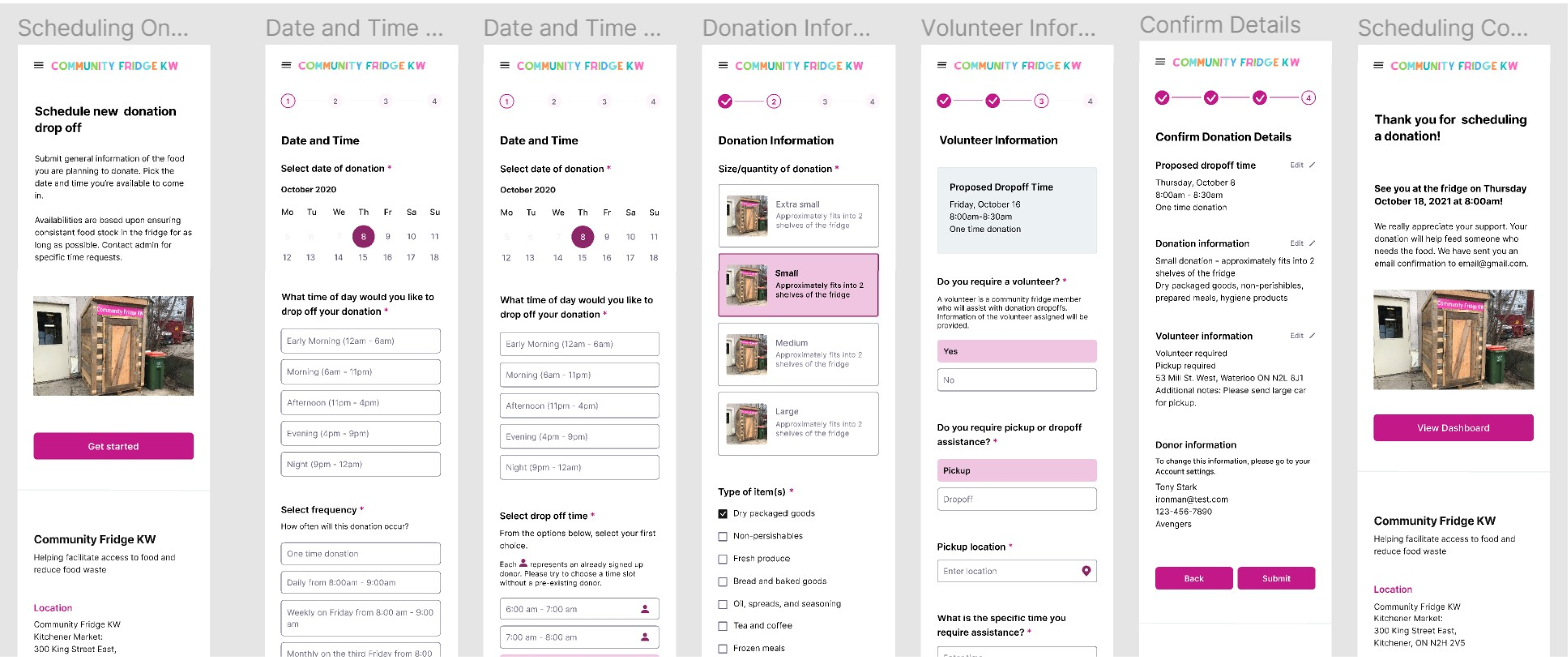
Facilitating donations
This section covers my process in creating the donation scheduling feature. I discuss my process of creating a better understanding of the donor user group, and designing the navigation bar.
The key feature that I focused on designing this term was the donor experience for scheduling. This was the first feature in our product roadmap, and so it was important that the preliminary designs were able to be completed within the first half of the term.
Setting the ground work
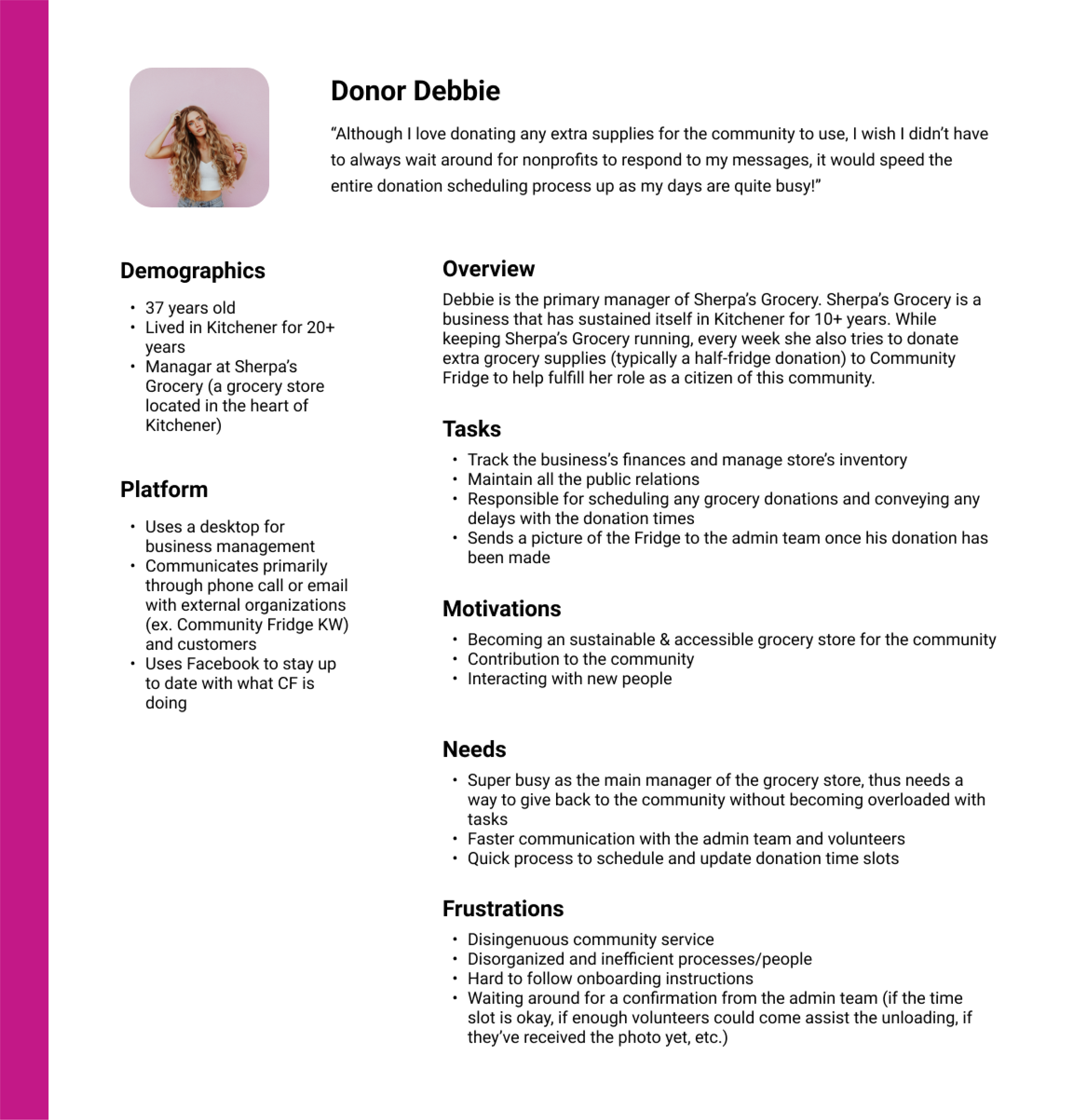
Before starting, I wanted a more holistic overview of the donor user base since they were the primary users of this feature. Since we were not able to conduct user interviews with the users, it was even more important that all the assumptions I was making when creating the scheduling feature for donors were clearly recorded and that each part of the feature related back to a specific need of the donors.
I created a persona which went over the key needs of the user as well as their current solutions to identify what currently worked, and what didn’t.
User persona of a typical volunteer to inform the target pain pointsbeing addressed
Understanding the market
We looked at four competitor scheduling websites to determine their strengths, weaknesses, areas for inspiration, and features which we knew didn’t work. Conducting a competitive analysis of the current market allowed us to better gauge what was currently being done well and what needed to be improved on.
We found that most websites currently had good automation, view availability for a large group of people, and allowed for communication within the platform itself. Some of the key pain points we found were that some platforms did not allow you to edit your timeslot, while other platforms allowed you to edit everyone's time slot- both of which were not features we wanted to include.
I found that most platforms leveraged segregating the information by group, and by using visuals to reduce the information overload.
After doing this, I set the following as the flow of information to be collected:
Date and time information, including frequency
Donation information
Summary
By having the information laid out in a more systematic way, it decreased the chance of donors feeling overwhelmed, and allowed for admin to view the information in a more approachable way. Breaking the complex tasks into smaller steps allows for the cognitive load to be decreased, and gave us the opportunity to gradually introduce the difference choices which needed to be made.
Flow of infomation through the system and where interactons were required
Designing the navigation bar
The first element of the page I tackled, and one of the most important parts of this feature was the navigation bar. Since the information was distributed into many sections, the navigation bar was how the donors would be able to tell how far into the submission process they were, and what information they needed to provide so they did not feel overwhelmed.
In the first version of the navigation bar, I had a simple line which was filled in to indicate how much of the process was completed. While this solved the need to show donors how far into the process they were visually, there was no clear indicator on how many parts there were in total.
Version one of the navigation bar
To combat this problem. I created a version where there were circles as visual indicators with numbers in them to show how many parts were in the process in total, and which part the user was currently on.
I also added in checkmarks and changed the colour of completed sections of the form to add a visual indicator to differentiate between completed sections, current sections, and sections left to complete. Doing this provided a holistic look at where the user was in a way which reflected patterns on other websites and did not overwhelm the user with too much information.
Version two of the navigation bar
For the desktop version of the navigation bar I kept with the stylistic choices made in the mobile version, however instead of having the numbers present as indicators I changed it to include the title of each page since I had more room. This allowed for more information to be given to the user given the lack of space constraints present in this viewport.


.png)
.png)
.png)
